Colour of the year to brighten up stationery

Pantone announces an inspiring shade for sensitive brands!
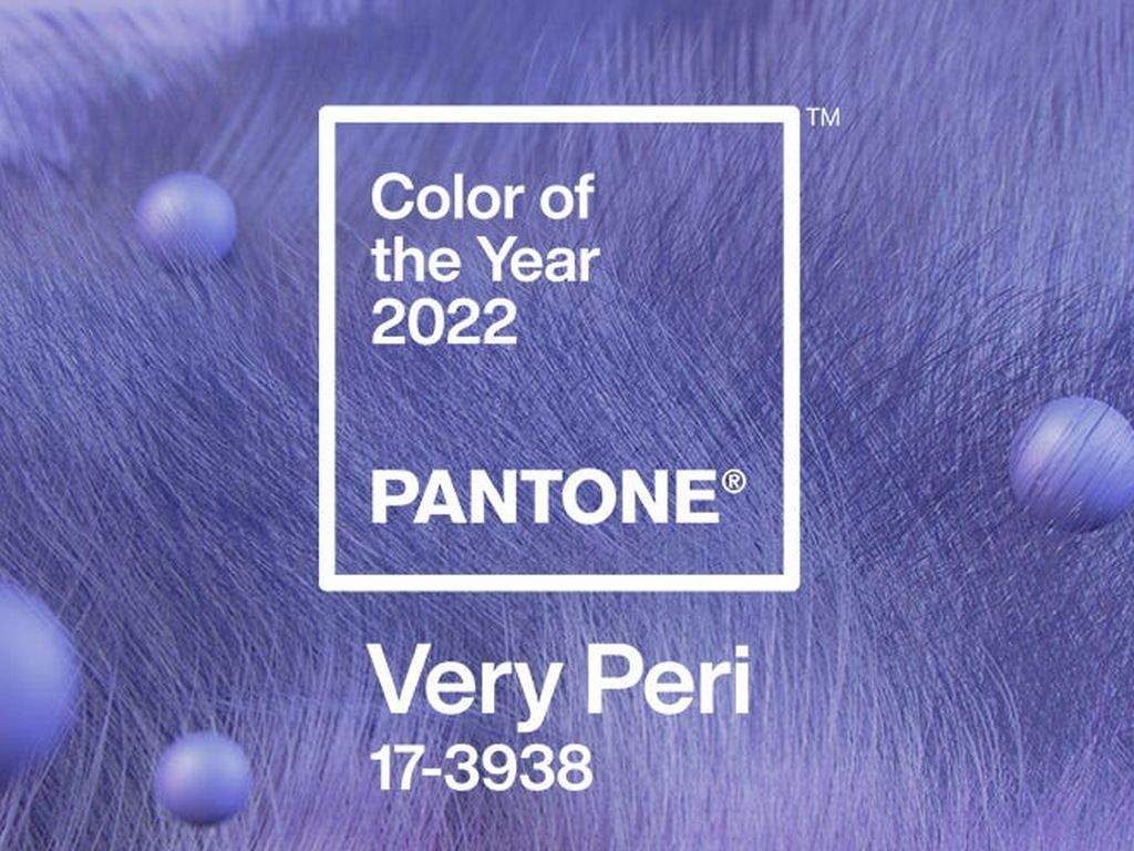
Pantone, the company that pioneered the use of numbers to classify colours for matching purposes, has announced its ‘çolour of the year’ for 2022.
Very Peri, described as “A New Pantone Colour Whose Courageous Presence Encourages Personal Inventiveness And Creativity”, the new red and blue hued colour represents “both consistency, excitement, and is a symbol of the global zeitgeist of the moment and the transition we are going through”, according to Pantone.
So how does this impact the stationery industry?
According to Pantone, Very Peri can be used strategically by brands to aid in development of their corporate identity, or the creation of new product lines.
“Colour is one of the most important factors in non-verbal communication, its psychological effects are so significant that it’s thought around 90 per cent of quick judgements are based on colour alone. More than just looking pretty, colours have been proven to affect emotions, meaning it’s undoubtedly something to consider when choosing items we’ll be using daily, giving as gifts, or hoping will increase motivation.
“Shades that encompass an aura of hope and creativity, much like Very Peri, can inspire and enthuse. Products incorporating these types of colours will carry a similar discourse; one of futuristic realisation,” the company said.
Date Published:
19 January 2022

