Officeworks makes another logo change

Stationery pin pulled out.
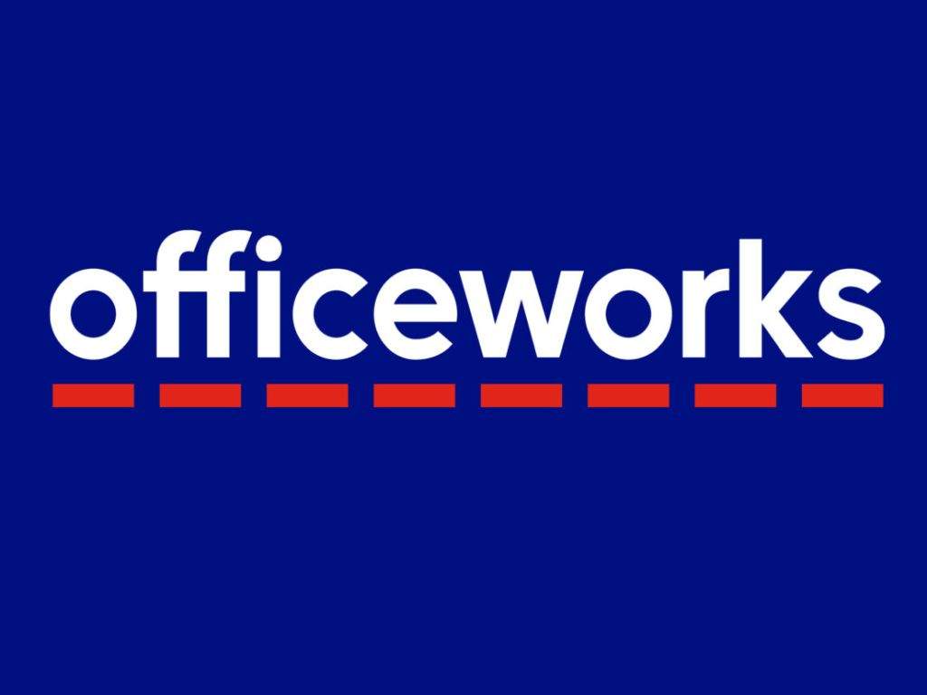
Officeworks has tweaked one of its logos, dropping the pin image from the long-standing corporate identity.
The design change was implemented by ad agency The Princiapls, who were also responsible for the new square logo featuring the letters OW.
The strategy for the new logo is best described by the retailer's ad agency:
Officeworks has always been a brand that makes bigger things happen. But the pandemic has changed way we work, learn, and create. So, Officeworks needed to change too.
We came on board to help with the rebrand including research, brand strategy, personality, brand voice and visual identity. We discovered that Australians liked and respected Officeworks, but it was missing its spark.
The opportunity? Tap into the creativity they inspire, and the joy of getting stuff done.
We crafted a dynamic, joyful and onto it personality, matching that sense of possibility and playfulness. And designed a brand identity that embraced their distinctive blue & red and the dash within their logo.
We also developed a new brand character – OWen – derived from their master logo. It’s a shorthand version that brings impact and a bit of fun to their digital channels and internal communications.
A new voice also positioned Officeworks as The Ally of Australians, empowering customers in every way.
We’re proud to say that this work culminated into us winning Officeworks’ New Partner of the Year award.
Date Published:
3 August 2022

